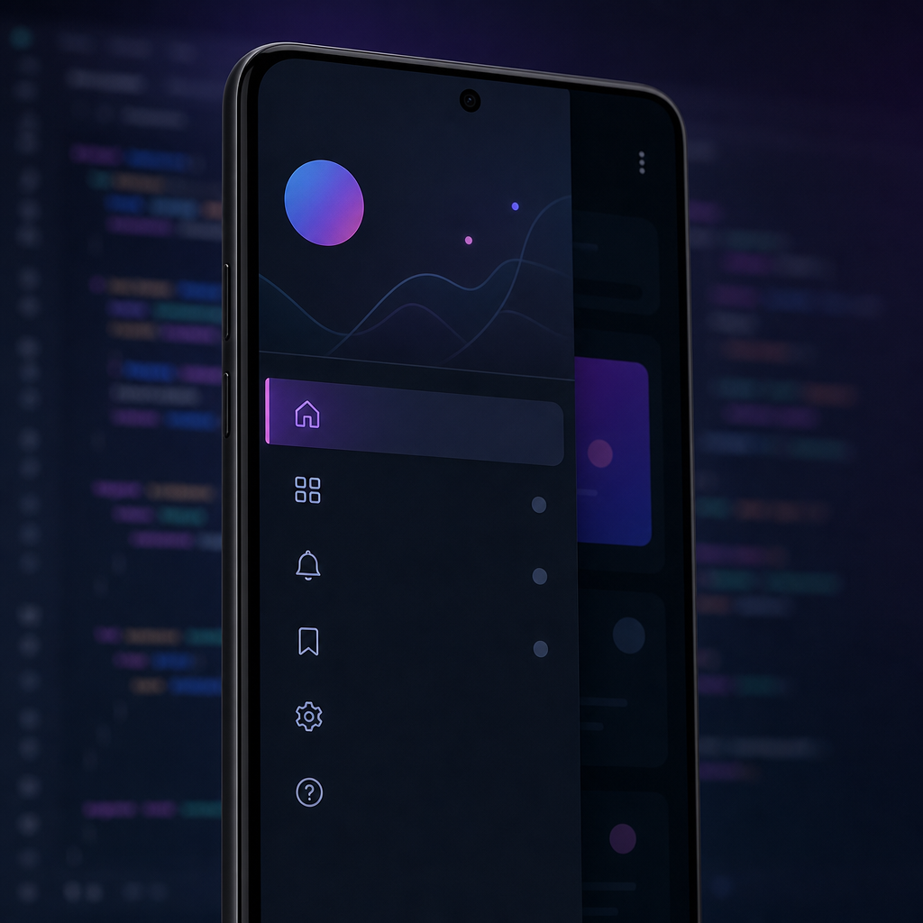
A navigation drawer is a slide‑in side panel that lets users jump between top-level screens in your app. In this step‑by‑step tutorial, you’ll learn how to create a navigation drawer in Android the modern way using Kotlin and Jetpack Compose (Material 3). You’ll also see a classic Views/XML example with DrawerLayout for learners who are not on Compose yet. By the end, you’ll know when to use a drawer, how to wire it to Navigation, how to make it adaptive for tablets, and how to fix common issues like the hamburger icon not opening the drawer.
What is a Navigation Drawer and when should you use it?
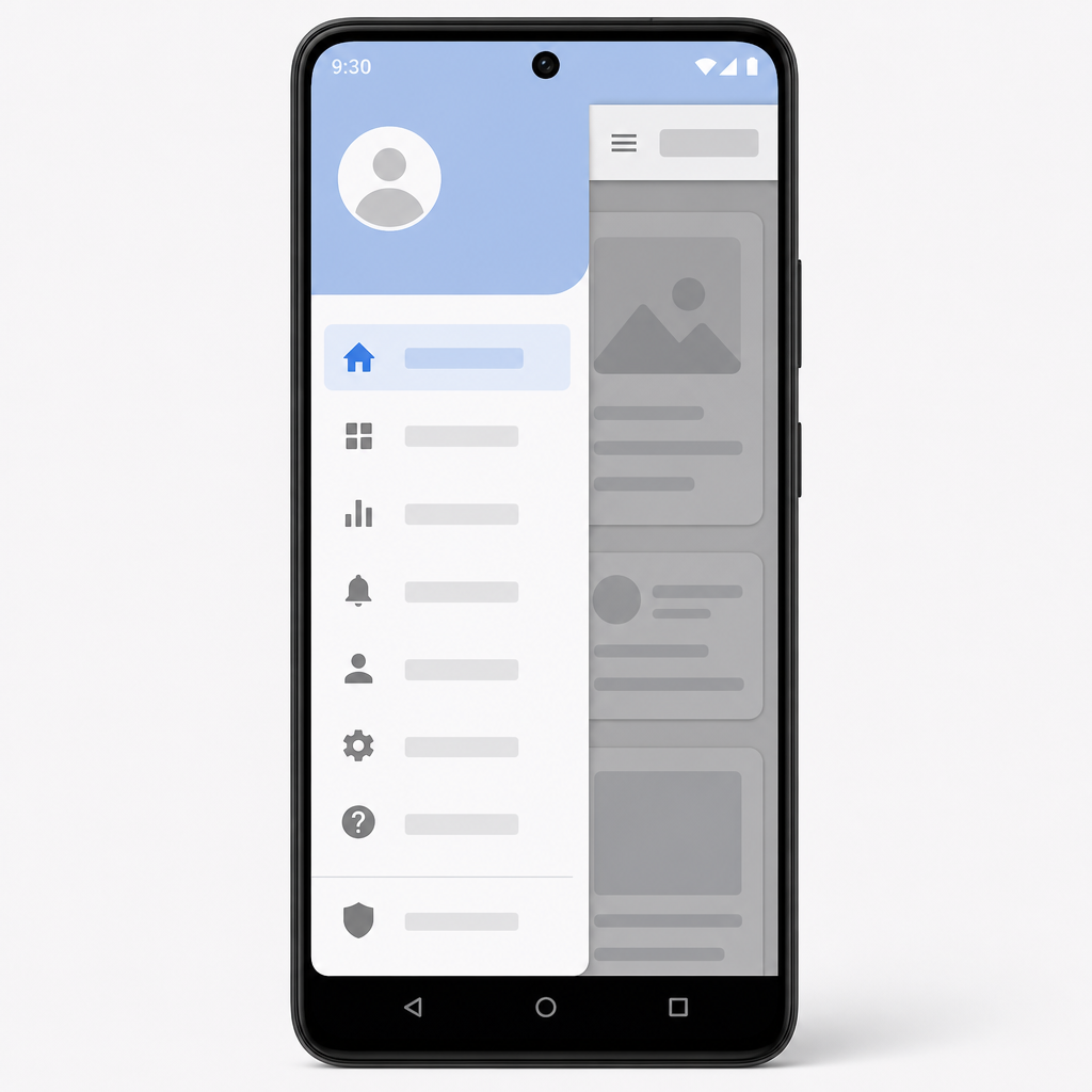
A navigation drawer is a panel that slides from the left (start) edge and shows top-level destinations. It works well when you have more than 3–5 primary sections, or when your app needs more space than a bottom bar can offer. In Material 3 you have:
- Modal drawer (phones) — overlays content and closes when the user taps outside.
- Dismissible drawer (wider layouts) — the content slides alongside the drawer.
- Permanent drawer (large screens) — always visible like a side panel.
Use a drawer for top-level destinations. For fewer destinations on phones, prefer a bottom navigation bar; on tablets/desktops, consider a navigation rail or a permanent drawer. Material 3 supports adaptive navigation so you can swap between these patterns by window size.
| Drawer type | How it behaves | Use it when… | Closes | Typical screens |
|---|---|---|---|---|
ModalNavigationDrawer |
Slides over content; content stays put. | Compact layouts with limited width. | Tap outside, select item, or Back. | Phones (portrait), small tablets. |
DismissibleNavigationDrawer |
Content shifts alongside the drawer. | Medium+ width where a side panel fits. | Programmatically or user swipe/back. | Tablets, landscape phones. |
PermanentDrawerSheet |
Always visible; app content sized beside it. | Large screens where navigation should persist. | Does not close (part of layout). | Desktops, large tablets. |
ModalNavigationDrawer and switch to Dismissible or Permanent based on window size classes.What you’ll build
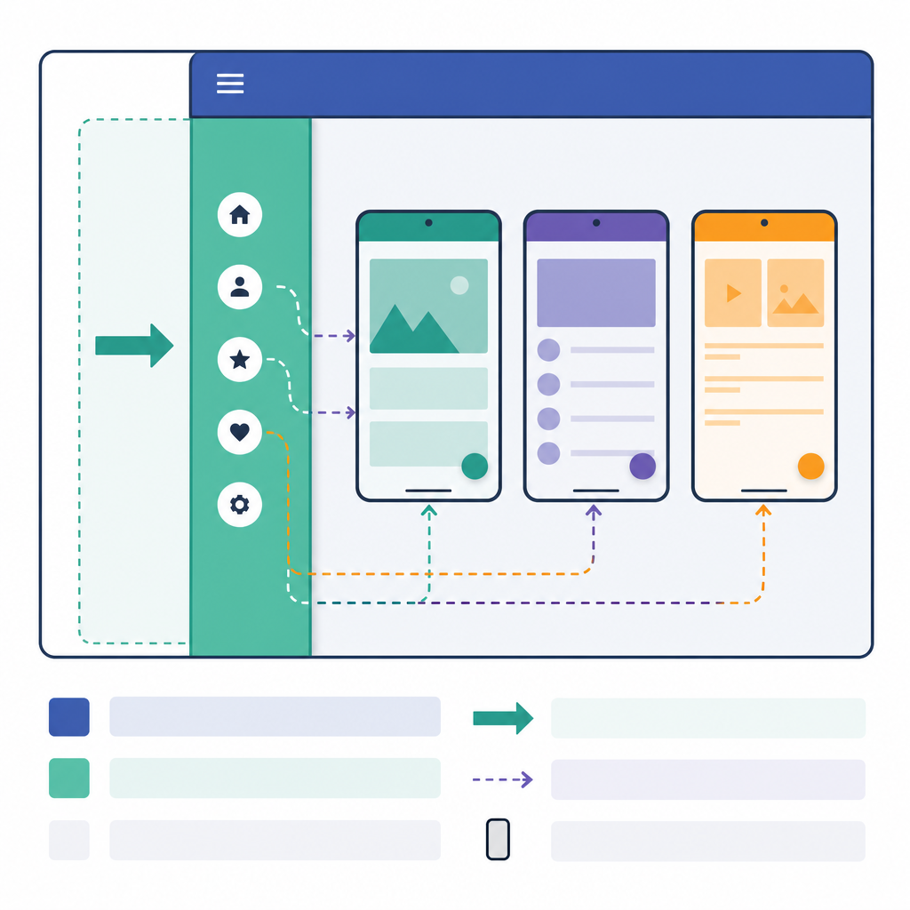
We’ll create a simple “Home / Profile / Settings” app that demonstrates:
- Compose Material 3 ModalNavigationDrawer for phones.
- Navigation with Navigation Compose (NavController).
- Edge‑to‑edge content and predictive back behavior.
- Optional: Dismissible drawer for tablets.
- Bonus: a classic DrawerLayout + NavigationView example (Kotlin and Java).
Prerequisites
- Android Studio (latest stable).
- Basic Kotlin knowledge (we’ll add a short Java snippet for the Views example).
- Min SDK 21+ (Compose supports API 21+). Target the latest API.
Quick start: how to create a navigation drawer in Android with Compose (Kotlin)
This is the modern, recommended approach. If you’re searching for “android navigation drawer tutorial for beginners” or “create navigation drawer in Android using Kotlin step by step,” follow the steps below.
1) Create a new Compose project
In Android Studio: New Project → Empty Activity (Jetpack Compose enabled).
2) Add dependencies
Open your app-level Gradle file and add Material 3, Navigation Compose, and icons. Use the latest Compose BOM in your project.
3) Enable edge-to-edge in your Activity
Edge‑to‑edge is expected on Android 15+ and makes your UI draw behind system bars with proper insets.
4) Define destinations
Create a simple model for your drawer items (route, label, icon). We’ll use three destinations.
5) Build the drawer + Navigation with Compose
In Material 3, the drawer is a dedicated composable (not a parameter on Scaffold). Use ModalNavigationDrawer for phones and wrap your Scaffold content inside it. The hamburger icon opens the drawer.
SmallTopAppBarscope.launch { drawerState.open() } opens ModalNavigationDrawerNavigationDrawerItem (e.g., Settings)navController.navigate(route) { launchSingleTop = true; restoreState = true; popUpTo(start) { saveState = true } }scope.launch { drawerState.close() } closes drawer; selected item stays highlightedBackHandler closes it; otherwise → navController.navigateUp()6) Make it adaptive for tablets/desktops (optional)
On larger screens, a dismissible or permanent drawer improves usability. Below is a minimal example using DismissibleNavigationDrawer when the width is medium or above. You can compute a window size class in your Activity and pass it down.
For very large screens, consider a permanent drawer (always visible) or Material 3’s adaptive NavigationSuite that can switch between a drawer, rail, or bottom bar automatically.
7) Why we chose this approach
- Material 3 uses dedicated drawer composables such as
ModalNavigationDrawerandDismissibleNavigationDrawer, not Scaffold’s old drawer slots. - Navigation Compose keeps your app stateful, restores state when reselecting, and avoids duplicate destinations with
launchSingleTopandpopUpTo. - Edge-to-edge drawing is on by default for Android 15+, so we call
enableEdgeToEdge()and let Material 3 handle insets in top bars and sheets. - Predictive back is supported; our
BackHandlerensures back closes the drawer first.
- ✅ Add Material 3, Navigation Compose, and icons dependencies (using the Compose BOM).
- ✅ Call
enableEdgeToEdge()in Activity. - ✅ Wrap
ScaffoldinsideModalNavigationDrawerwith aModalDrawerSheet. - ✅ Keep a single
rememberNavController()and a singlerememberDrawerState()at the app root. - ✅ Wire the hamburger IconButton to
scope.launch { drawerState.open() }. - ✅ On item click: navigate with
launchSingleTop/restoreState, thendrawerState.close(). - ✅ Add
BackHandler(enabled = drawerState.isOpen)to close the drawer first. - ✅ Use start/end for RTL and test dark mode + edge-to-edge.
- ✅ Make
DrawerLayoutthe root, put content first, thenNavigationViewwithlayout_gravity="start". - ✅ Set
MaterialToolbaras the support ActionBar:setSupportActionBar(toolbar). - ✅ Create
AppBarConfigurationwith your top-level destination IDs and theDrawerLayout. - ✅ Call
setupActionBarWithNavControllerandnavView.setupWithNavController. - ✅ Keep drawer items in
res/menu/and destinations in aNavGraph.
Classic Views/XML: DrawerLayout + NavigationView (Kotlin/Java)
If you need a “navigation drawer Android Studio step by step” example with XML, use DrawerLayout + NavigationView and wire it to the Jetpack Navigation component. This is the typical “android drawerlayout tutorial simple” pattern and works great for “android navigation drawer with fragments for beginners.”
1) Layout XML
Create res/layout/activity_main.xml with DrawerLayout as the root. Note the NavigationView is aligned to start for RTL support.
2) Drawer menu
Create res/menu/drawer_menu.xml with your items.
3) Navigation graph
Create res/navigation/nav_graph.xml and add your fragment destinations.
4) Activity (Kotlin)
Use NavigationUI to connect the Toolbar and NavigationView to your NavController. This is the modern alternative to manually wiring an ActionBarDrawerToggle.
5) Activity (Java)
For “java navigation drawer example android,” here’s the equivalent Activity code in Java.
Troubleshooting: hamburger icon doesn’t show or open
- Views/XML: Ensure you call
setSupportActionBar(toolbar), set upAppBarConfigurationwith your top-level destination IDs, and callsetupActionBarWithNavController. Do not rely onActionBarDrawerTogglealone when using the Navigation component. - Views/XML: The
NavigationViewmust haveandroid:layout_gravity="start"and be a direct child ofDrawerLayout. Ensure it’s declared after the main content. - Compose: Place
Scaffoldinside theModalNavigationDrawer, and open the drawer in the top app bar withscope.launch { drawerState.open() }. - Compose: If clicks don’t respond, verify you’re using
rememberDrawerStateand that the drawer is not nested inside another conflicting layout. - Both: On back press, close the drawer first. In Compose, use
BackHandleras shown.
Output / Result
On phones, tapping the hamburger icon slides a modal drawer from the left. Selecting “Home,” “Profile,” or “Settings” navigates between screens while keeping the selected state highlighted in the drawer. Tapping outside the drawer or pressing back closes it. On wider screens, the dismissible drawer stays visible as the content shifts, making multitasking easier.
FAQ: People also ask
What is a Navigation Drawer in Android and when should I use it?
A navigation drawer is a side panel for top-level destinations. Use it when you have multiple primary sections and need more space than a bottom bar offers. Prefer modal drawers for phones, and dismissible or permanent drawers for large screens. For very few destinations, a bottom bar may be better.
How do I create a Navigation Drawer in Android Studio from scratch?
Compose path: start a Compose project, add Material 3 and Navigation Compose, wrap your content in ModalNavigationDrawer, build NavigationDrawerItems, and navigate via NavController. Classic path: use DrawerLayout + NavigationView with a NavHostFragment, and connect them using NavigationUI. Both are shown above step by step.
Which is easier for beginners, Kotlin or Java, to build a Navigation Drawer?
Kotlin with Jetpack Compose is the easiest for new Android learners today. It requires less boilerplate, works seamlessly with Material 3, and integrates with Navigation Compose. If you must work with legacy code, Kotlin or Java both work with DrawerLayout, but Kotlin is generally more concise.
How do I connect Navigation Drawer items to open fragments or activities?
Compose: in NavigationDrawerItem(onClick), call navController.navigate(route) with launchSingleTop and popUpTo. Views: call navView.setupWithNavController(navController); it automatically navigates to destinations defined in your Navigation graph. For activities, prefer a single-activity app with fragments and the Navigation component.
Why doesn’t the hamburger icon show or open the drawer and how can I fix it?
Compose: ensure your top app bar’s navigation icon calls drawerState.open() and the drawer wraps the Scaffold. Views: set the Toolbar as the support action bar, create AppBarConfiguration with your top-level IDs and DrawerLayout, then call setupActionBarWithNavController. Also ensure your NavigationView has layout_gravity="start" and is a direct child of DrawerLayout.
Best practices and tips
- Don’t overload the drawer; keep it for top-level destinations only. Use secondary surfaces (settings/about) at the bottom.
- Preserve state when reselecting items using the Navigation options shown above.
- Test edge-to-edge and dark mode. Material 3 handles insets and contrast for you.
- Support RTL by using start/end, not left/right, and let the drawer mirror automatically.
- Make navigation adaptive: drawer on large screens, bottom bar/rail on compact screens when appropriate.
Why this tutorial is up to date
This “material design navigation drawer android tutorial” uses the current Material 3 pattern. Scaffold no longer hosts the drawer; you should use dedicated drawer composables. We also covered predictive back, edge-to-edge, and adaptive navigation to fit phones, tablets, and desktops.
Wrapping up
If you’re learning how to add a navigation drawer in Android Studio, start with the Compose version above. It’s concise, modern, and beginner-friendly. If your project still uses Views, the DrawerLayout + NavigationView approach is stable and easy to follow. Either way, you now have a complete, step-by-step guide for how to create a navigation drawer in Android with working code and best practices.
Sources / Further reading
- Navigation drawer (Compose) — overview and examples: developer.android.com/develop/ui/compose/components/drawer
- Quick guide: Create a slide‑in menu with the navigation drawer (Compose): developer.android.com/develop/ui/compose/quick-guides/content/create-navigation-drawer
- ModalNavigationDrawer — Material 3 API reference: developer.android.google.cn/reference/kotlin/androidx/compose/material3/ModalNavigationDrawer.composable
- DismissibleNavigationDrawer — Material 3 API reference: developer.android.com/reference/kotlin/androidx/compose/material3/DismissibleNavigationDrawer.composable
- PermanentDrawerSheet — Material 3 API reference: developer.android.com/reference/kotlin/androidx/compose/material3/PermanentDrawerSheet.composable
- Navigation Compose — package summary: developer.android.google.cn/reference/kotlin/androidx/navigation/compose
- Compose Material 3 release notes (predictive back, updates): developer.android.com/jetpack/androidx/releases/compose-material3