Material Design buttons are the simplest way to build clear, tappable actions in Android apps. In this step-by-step guide, you’ll learn exactly how to use Material Design buttons in Android using modern Jetpack Compose (recommended) and classic XML with MaterialButton. We’ll cover button types, styling (color, shape, size), adding icons, handling clicks in Kotlin and Java, accessibility tips, and when to choose each approach. By the end, you’ll know how to add and style Material buttons confidently in new or existing projects.
What are Material Design buttons, and when should you use them?
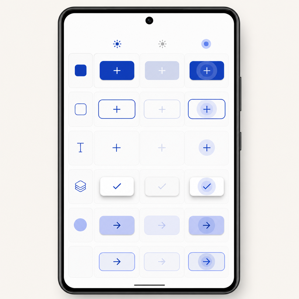
Material Design buttons are prebuilt, accessible components that follow Google’s Material 3 (M3) design system. They give your app consistent look, feel, and behavior with minimal code.
- Jetpack Compose (recommended for new apps): Use Material 3 composables like
Button,FilledTonalButton,ElevatedButton,OutlinedButton, andTextButtonfromandroidx.compose.material3. - View system (XML, legacy or existing apps): Use
com.google.android.material.button.MaterialButtonandMaterialButtonToggleGroupwith a Material 3 theme.
Pick Compose for new development (it’s the Compose-first path for Material on Android). Stick with Views in existing projects until you migrate.
Compose vs XML for Material 3 buttons
| Approach | Main APIs | Dependency | Theme requirement | Best for |
|---|---|---|---|---|
| Jetpack Compose | Button, FilledTonalButton, ElevatedButton, OutlinedButton, TextButton, SegmentedButton |
androidx.compose.material3:material3 via Compose BOM |
MaterialTheme (M3 colorScheme, shapes, typography) |
New apps, rapid UI iteration, Kotlin-first teams |
| Views (XML) | MaterialButton, MaterialButtonToggleGroup |
com.google.android.material:material |
Theme.Material3.* parent in app theme |
Existing XML screens, incremental adoption, Java support |
Tip: For “How to use Material Design buttons in Android” in 2026+—prefer Compose unless you must stay on XML.
Project setup
If you’re using Jetpack Compose (recommended)
Add the Compose Bill of Materials (BOM) and Material 3 dependency. The BOM keeps all Compose versions aligned:
Use the latest versions from the AndroidX releases index. Wrap screens with MaterialTheme so buttons pick up your color scheme, typography, and shapes.
If you’re using the View system (XML)
Add the Material Components dependency and apply a Material 3 theme.
Enable a Material 3 parent theme in themes.xml (or styles.xml):
Flow: From setup to your first Material button
material3MaterialTheme (M3)Button { Text("Click") }onClick { ... } in Kotlincom.google.android.material:materialTheme.Material3.* in app themeMaterialButton in XMLsetOnClickListener { ... }This flow is a quick memory aid for beginners learning how to use Material Design buttons in Android across Compose and XML.
Add your first Material button in Compose
Here’s a minimal Compose screen with the most common button variants.
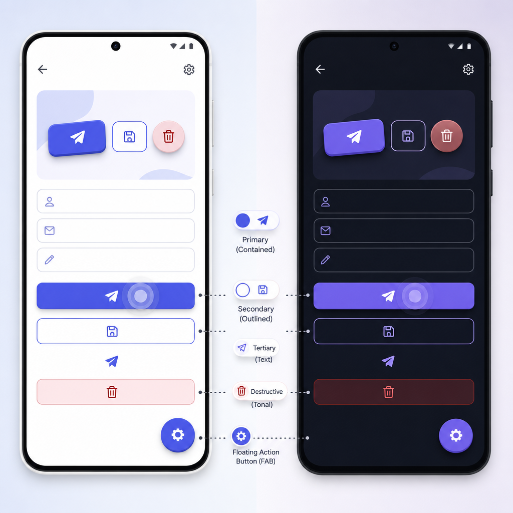
Guideline: use higher-emphasis buttons (Filled, FilledTonal, Elevated) for primary actions; use Outlined and Text buttons for secondary/tertiary actions.
Styling: change color, shape, and size (Compose)
You can override colors, shapes, and sizes at the button level or via your theme.
Compose Material 3 buttons include proper state layers and ripples by default, so you don’t need to add them manually.
Handle button clicks in Compose (Kotlin)
Segmented buttons (Compose)
Use segmented buttons for mutually exclusive choices.
Using MaterialButton in XML (Views)
If you’re maintaining a Views-based app, you can add Material Design buttons with MaterialButton. Make sure your activity/theme uses a Theme.Material3.* parent.
Add a MaterialButton in a layout
Common style options are Widget.Material3.Button, .FilledTonalButton, .ElevatedButton, .OutlinedButton, and .TextButton.
Change MaterialButton color and shape (XML)
For quick demos, you can customize directly on the view, but prefer theme-level colors for production.
In Material 3, it’s best to set your color scheme in the theme (e.g., colorPrimary, colorSecondary) so all buttons update consistently.
Handle MaterialButton clicks in Kotlin and Java
Kotlin:
Java:
Toggle groups with MaterialButtonToggleGroup (Views)
Use toggle groups for single or multiple selection.
In code, you can observe checked states via addOnButtonCheckedListener.
Practical tips for Android button styles (Material 3)
- Stick to one primary button per screen to reduce confusion.
- Use icons sparingly; pair them with text unless the meaning is universally clear.
- Keep minimum touch targets at least 48dp x 48dp.
- Use content labels for icon-only controls and verify with Accessibility Scanner.
- Respect contrast: text should meet accessible contrast against the container color.
- Prefer theme-level styling for consistent appearance across the app.
Pre-release checklist: Material 3 buttons
- Primary CTA appears once per screen; secondary actions use Outlined/Text.
- Touch target ≥ 48dp height and width (Compose: set min height; XML: ensure padding).
- Readable label using sentence case and localized strings.
- Icon-only buttons have
contentDescription(Compose) orandroid:contentDescription(XML). - Contrast checked for label vs. container across light/dark themes.
- States verified: default, pressed, focused, disabled (ripple/state layers visible).
- Keyboard focus works: tab to button and press Enter/Space activates it.
- TalkBack/VoiceOver announces label and state correctly.
- No hardcoded per-view colors unless intentionally overriding theme.
- Click handlers are idempotent or debounce long operations to prevent double taps.
Use this list whenever you add or restyle buttons to ensure quality and accessibility.
Putting it together: a simple screen (Compose)
Output / Result
When you run the Compose sample, you’ll see a screen titled “Material Buttons” showing:
- A vertical stack of buttons: Filled, FilledTonal, Elevated, Outlined, Text, Disabled, and one with an icon and label.
- A custom-styled rounded button with a custom color.
- A segmented control with “Day”, “Week”, “Month” where only one option can be active.
- Each click updates a visible counter or shows a Toast, confirming that clicks are handled correctly.
Common mistakes to avoid
- Using plain AppCompat
Buttonand expecting Material 3 styling. Use Compose Material 3 buttons orMaterialButtonwith a Material 3 theme. - Overusing high-emphasis (filled) buttons on one screen. Match button emphasis to action importance.
- Touch targets under 48dp or tiny icon-only buttons without labels.
- Hardcoding colors on individual buttons instead of theming—this makes maintenance harder.
FAQ: People also ask
What is a MaterialButton in Android?
MaterialButton is the Material Components button for the View system (XML). It supports Material 3 styles, icons, strokes, and shape customization. In Jetpack Compose, the equivalent components are Button, FilledTonalButton, ElevatedButton, OutlinedButton, and TextButton from androidx.compose.material3.
How do I add Material Design buttons in Android Studio?
- Compose: add the Compose BOM and
androidx.compose.material3:material3, then useButton { Text("...") }in your composables. - Views: add
com.google.android.material:material, set your app theme toTheme.Material3.*, then addMaterialButtonin your XML layout.
How do I change the color and shape of a MaterialButton?
- Compose: use
ButtonDefaults.buttonColors(...)and theshapeparameter (e.g.,RoundedCornerShape(24.dp)). - Views: use theme-level colors or view attributes like
android:backgroundTint,app:cornerRadius, andapp:strokeColor; or apply aWidget.Material3.Button.*style variant.
Do I need the Material Components library to use MaterialButton?
Yes. For XML-based apps, add com.google.android.material:material. For Compose, use the Material 3 Compose library androidx.compose.material3:material3 managed by the Compose BOM.
How do I handle MaterialButton clicks in Kotlin or Java?
- Compose: pass an
onClicklambda to the button. - Views: call
setOnClickListener { ... }in Kotlin orsetOnClickListener(...)in Java.
Recap: How to use Material Design buttons in Android
- Use Jetpack Compose Material 3 buttons for new apps; use
MaterialButtonin existing XML apps. - Add dependencies via the Compose BOM (Compose) or Material Components (Views).
- Choose the right emphasis: Filled for primary, Tonal/Elevated for supporting, Outlined/Text for secondary/tertiary.
- Style via theme first; override per-button only when needed.
- Ensure accessibility: 48dp targets, good contrast, clear labels.
Sources / Further reading
- Create a button — Jetpack Compose (Material 3): developer.android.com/develop/ui/compose/quick-guides/content/create-button
- Button API reference (Compose M3): developer.android.com/reference/kotlin/androidx/compose/material3/Button.composable
- Segmented button (Compose M3): developer.android.com/develop/ui/compose/components/segmented-button
- Use a Bill of Materials (BOM) — Compose: developer.android.com/develop/ui/compose/bom
- AndroidX Compose releases: developer.android.google.cn/jetpack/androidx/versions
- MaterialButton API (Views): developer.android.com/reference/com/google/android/material/button/MaterialButton
- MaterialButtonToggleGroup API (Views): developer.android.com/reference/com/google/android/material/button/MaterialButtonToggleGroup
- MDC-Android getting started: github.com/material-components/material-components-android
That’s it! You’ve learned how to use Material Design buttons in Android with both Jetpack Compose and the classic View system, including how to add them, style them, and handle clicks in Kotlin and Java. Try these patterns in your next screen and keep your UI consistent, accessible, and modern.