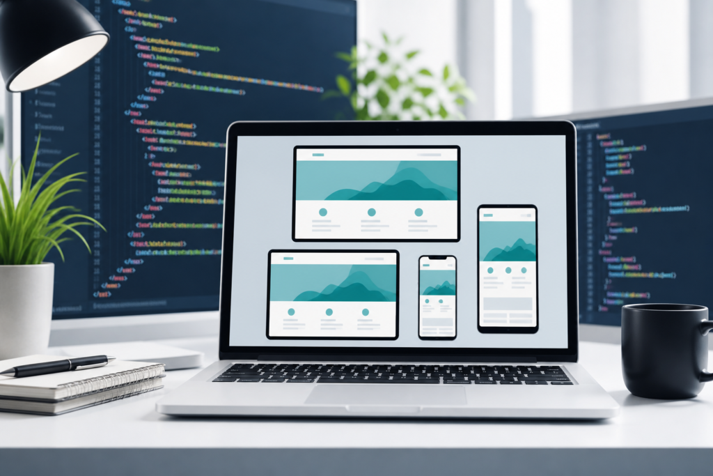
Creating a modern, responsive website has become a must-have skill for students, bloggers, small business owners, and aspiring developers alike. With the rise of mobile devices accounting for over 60% of global web traffic as of 2026, building a responsive website ensures your content looks great and functions seamlessly on any screen size. This beginner-friendly tutorial will guide you step-by-step through building a responsive website using HTML5 and CSS3, leveraging the latest best practices in responsive web design.
What Is Responsive Web Design and Why Is It Important?
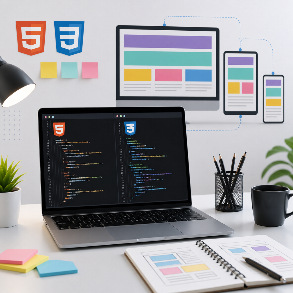
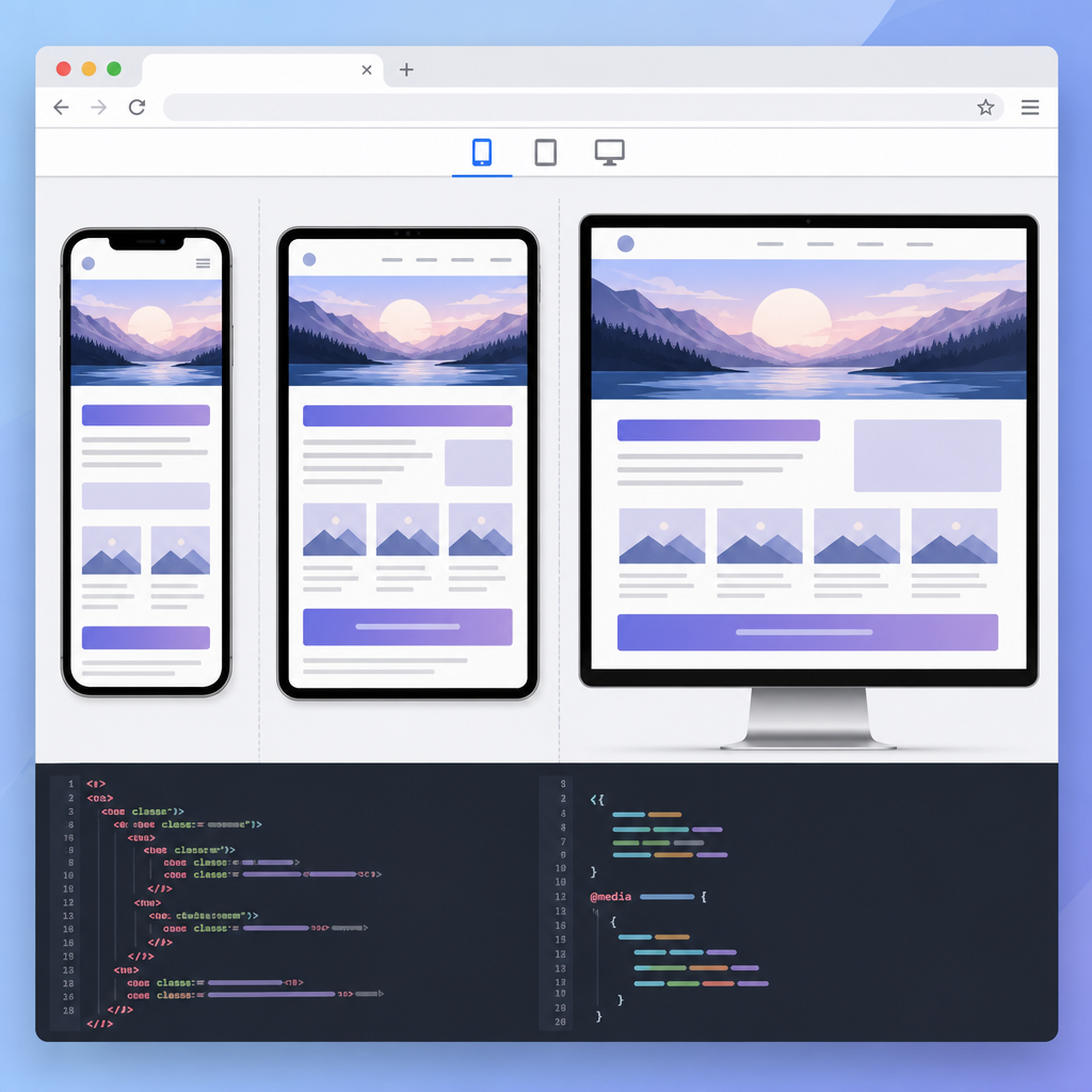
Responsive web design is a method of creating websites that automatically adjust their layout, images, and functionalities to suit the screen size and orientation of the device being used. Whether visitors access your site on a smartphone, tablet, or desktop, the user experience remains consistent and optimized.
With mobile devices generating the majority of web traffic today, a responsive website is no longer optional but essential — it improves user satisfaction, accessibility, and search engine rankings. Modern CSS techniques such as fluid typography, container queries, and CSS Grid layouts make responsive design more powerful and easier to implement than ever before.
Key Takeaway: Why Responsive Design Matters in 2026
- Enhances user experience across devices
- Boosts SEO rankings through mobile-friendliness
- Improves accessibility for diverse user needs
- Supports modern, flexible CSS technologies
Getting Started: Essential Tools for Building a Responsive Website
Before diving into code, you’ll need some basic tools:
- A Code Editor: VS Code, Sublime Text, or Atom are popular choices, offering syntax highlighting and live previews.
- A Modern Web Browser: Chrome, Firefox, or Edge with developer tools for testing responsiveness.
- Optional: Local server setup (like XAMPP or Live Server extension for VS Code) to preview your site.
Once you have these ready, you’re set to start your beginner web development journey!
Checklist: Preparing Your Tools for Building Responsive Websites
- Install a code editor like VS Code or Sublime Text
- Use a modern web browser with developer tools
- Optional: Set up a local server for live previews
- Familiarize yourself with HTML5 and CSS3 basics
- Plan a simple website structure and design
A Step by Step Guide to Building a Responsive Website with HTML5 and CSS3
1. Structure Your HTML5 Document
Start with a clean HTML5 boilerplate that includes semantic tags for better accessibility and SEO:
<!DOCTYPE html>
<html lang="en">
<head>
  <meta charset="UTF-8">
  <meta name="viewport" content="width=device-width, initial-scale=1.0">
  <title>Responsive Website Tutorial</title>
</head>
<body>
  <header>
    <h1>Welcome to My Responsive Site</h1>
  </header>
  <nav>
    <ul>
      <li><a href="#">Home</a></li>
      <li><a href="#">About</a></li>
      <li><a href="#">Services</a></li>
      <li><a href="#">Contact</a></li>
    </ul>
  </nav>
  <main>
    <section>
      <h2>Our Mission</h2>
      <p>We create beautiful responsive websites with HTML5 and CSS3.</p>
    </section>
  </main>
  <footer>
    <p>© 2026 Responsive Web Design Tutorial</p>
  </footer>
</body>
</html>
Note the <meta name="viewport"> tag—this is crucial for controlling layout on mobile devices.
2. Apply Basic CSS3 Styles
Next, add some CSS to style your page and make it adaptable. Create a styles.css file and link it in the head section:
<link rel="stylesheet" href="styles.css">
Here’s a simple starting point:
/* Reset some default styling */
* {
  margin: 0;
  padding: 0;
  box-sizing: border-box;
}

/* Body font and background */
body {
  font-family: Arial, sans-serif;
  line-height: 1.6;
  background-color: #f9f9f9;
  padding: 20px;
}

/* Navigation styling */
nav ul {
  list-style: none;
  display: flex;
  justify-content: space-around;
  background: #333;
  padding: 10px;
}

nav a {
  color: white;
  text-decoration: none;
  font-weight: bold;
}

nav a:hover {
  text-decoration: underline;
}

/* Main and footer */
main {
  margin-top: 20px;
}

footer {
  text-align: center;
  margin-top: 30px;
  color: #555;
}
3. Make It Responsive with CSS Media Queries and Modern CSS
Using a mobile-first approach, start designing for small screens first, then use media queries to enhance for larger devices:
@media (min-width: 600px) {
  nav ul {
    justify-content: center;
    gap: 30px;
  }

  main {
    max-width: 700px;
    margin: 20px auto;
  }
}
To take advantage of modern CSS3, consider adding fluid typography using the clamp() function for scalable text:
h1 {
  font-size: clamp(1.5rem, 4vw, 2.5rem);
}
For layouts, CSS Grid or Flexbox provide powerful tools to keep your design flexible. Here is an example of a simple grid layout with intrinsic sizing:
main {
  display: grid;
  grid-template-columns: repeat(auto-fit, minmax(250px, 1fr));
  gap: 15px;
}
Responsive Design Process Flow for HTML5 & CSS3
Define semantic HTML5 layout
Add CSS3 reset and base styles
Use media queries and fluid typography
Enhance with container queries & test devices
4. Use Container Queries for Better Control (Advanced)
As of 2026, container queries are becoming a standard way to write CSS that responds to the size of its parent container rather than the viewport. This allows more modular, reusable components.
@container (min-width: 400px) {
  section {
    background-color: #e0f7fa;
    padding: 15px;
    border-radius: 5px;
  }
}
Note: Be sure your browser supports container queries or provide fallbacks.
5. Optimize Images and Media
Responsive web design means also using flexible images that resize with the layout. Use CSS like this:
img {
  max-width: 100%;
  height: auto;
  display: block;
}
Additionally, use modern image formats like WebP for faster loading and better performance, which also improves SEO.
HTML5 & CSS3 Responsive Design Relative Importance Guide
Practical Tips for Beginners
- Start small: Build a simple page and gradually add responsive features.
- Use browser developer tools to test responsiveness by resizing or emulating devices.
- Validate your HTML5 and CSS3 to avoid errors that may affect layout.
- Read tutorials tailored for beginners such as the HTML5 tutorial for beginners available on CodDesire.com.
- Explore tools like Nexus AI by CodDesire for assistance in writing and optimizing code.
How Small Business Owners Can Create Responsive Websites
Small business owners without prior coding experience can use this tutorial as a foundation to understand how responsive websites work. Coupling this knowledge with website builders or minimalist coding skills enables you to maintain and update your site without needing professional help every time.
Applying best practices such as a mobile-first mindset, optimized images, and accessibility considerations can make your website stand out and reach more visitors effectively.
Frequently Asked Questions (FAQ)
What is responsive web design and why is it important?
Responsive web design adjusts a website’s layout and content to fit various screen sizes and devices, ensuring an optimal user experience. It’s important because most users browse on mobile devices, and search engines prioritize mobile-friendly sites.
How do I start learning HTML5 and CSS3 for responsive websites?
Begin with the basics of HTML5 structure and CSS3 styling. Follow beginner tutorials, practice by building simple pages, and gradually add responsive features using media queries and modern CSS techniques like Flexbox and Grid.
Can beginners create professional looking responsive websites?
Absolutely! With a clear understanding of fundamentals and by leveraging modern tools and resources, beginners can create polished, responsive sites that look professional and function well across devices.
What tools do I need to build a responsive website with HTML5 and CSS3?
You need a code editor (e.g., VS Code), a modern web browser for testing, and optionally a local server setup. Additional helpful tools include online tutorials, validation services, and AI-assisted coding platforms like Nexus AI.